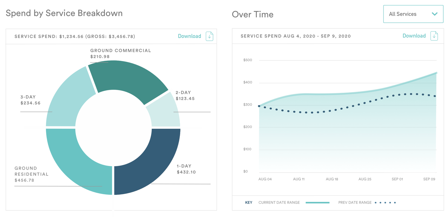
The Spend by Service Breakdown pie chart (on the left) visually represents the distribution of services used within a specified date range selected from the filter bar. This chart exclusively covers transportation and service charges. When hovering over each service segment, you’ll see detailed information, including:
- The total percentage of spend for that service
- The total spend amount for the service
- The number of packages using that service
The Over Time graph (on the right) displays the total weekly service spend over a specified period, based on the date range selected from the filter bar. By hovering over different weeks on the graph, you can view the exact service spend for that particular week.
To narrow down the Over Time graph to a specific service, click the All Services dropdown and select the particular service you wish to display.
